Role & responsibilities
Product Designer driving end-to-end UI/UX for a new firm-wide internal access portal
As the design lead, I conducted user research, facilitated design workshops, and partnered closely with cross-functional stakeholders to define a seamless experience and improve resource discoverability. I led end-to-end design efforts—sketching, wireframing, and delivering high-fidelity designs and interactive prototypes—to inform a new navigation, UI, and overall experience for users.
Collaborators
Stakeholders & Business partners (HR, Branch & home office associates, Corporate services, Technology, Real Estate +more) Product, Engineering, Research, Accessibility, Legal
Goal & Outcome
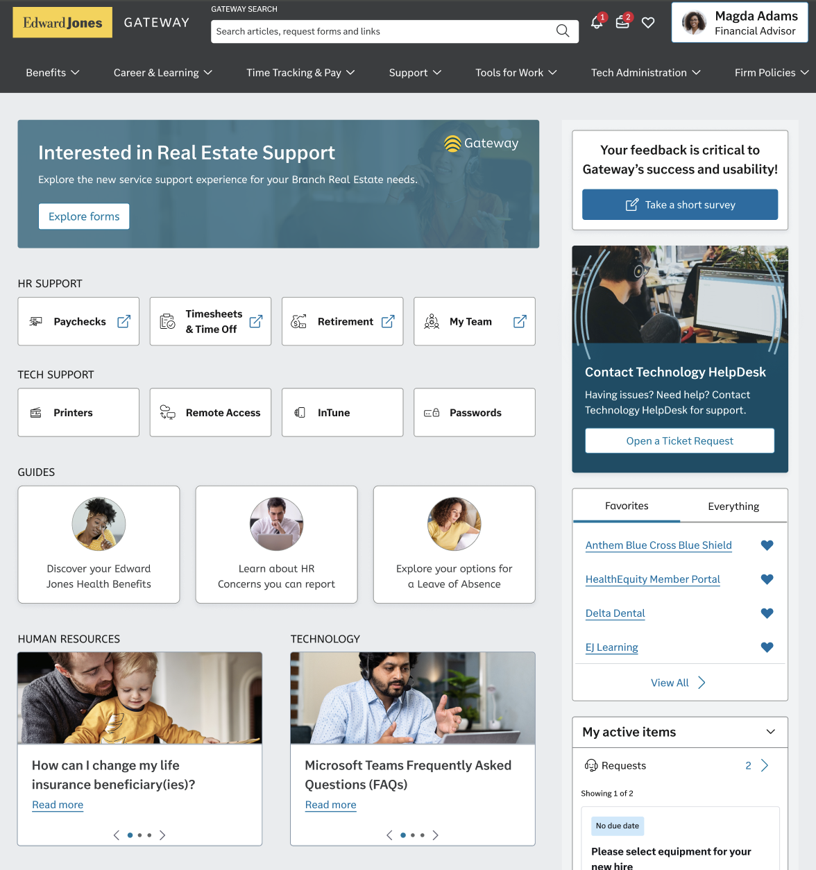
The goal was to design an internal gateway/access layer that simplified how employees access tools and support, enabling faster self-service, clearer navigation, and reduced help desk demand while also improving system design and efficiencies.
Overview
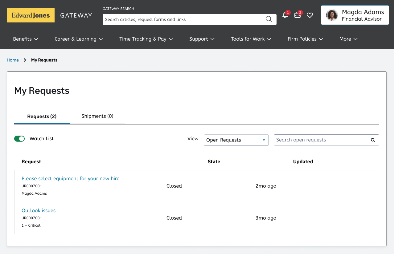
At Edward Jones, associates lacked a user-friendly and efficient way to complete self-service tasks. The self-service experience was fragmented and overly complex, with resources spread across multiple systems and an oversaturated intranet.
Associates spent excessive time searching for information, struggled to find the correct forms or paths, and frequently escalated issues to the Help Desk—driving inefficiency, frustration, and increased support volume.

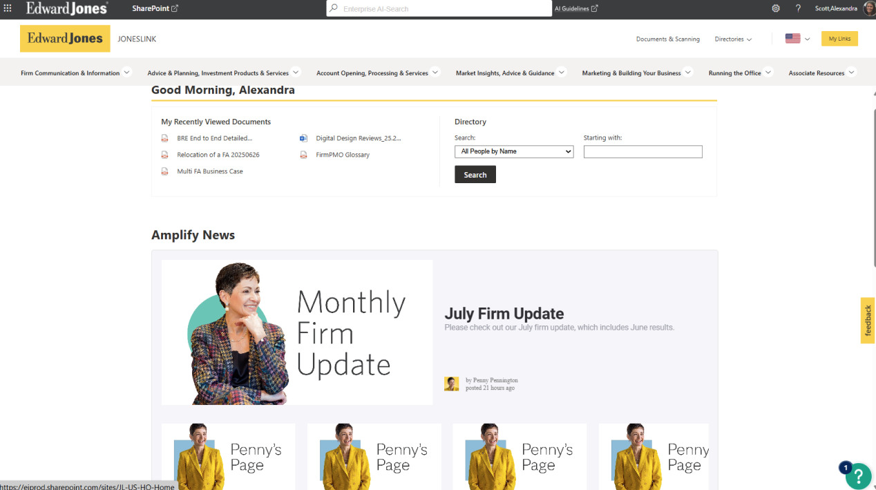
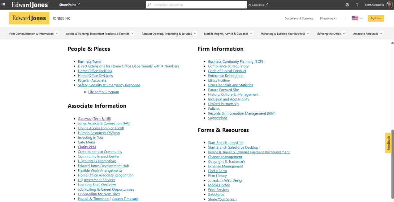
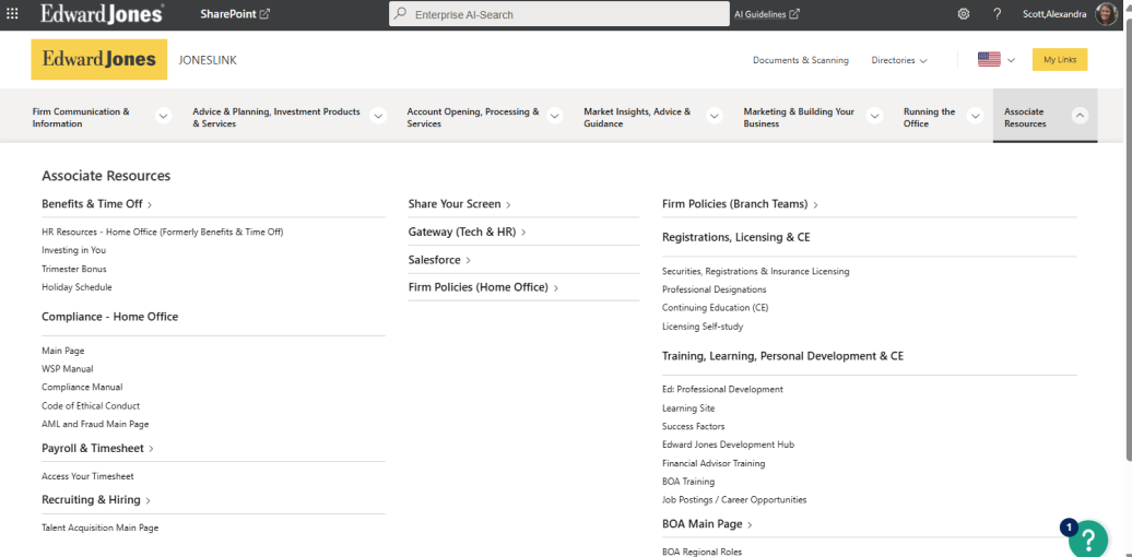
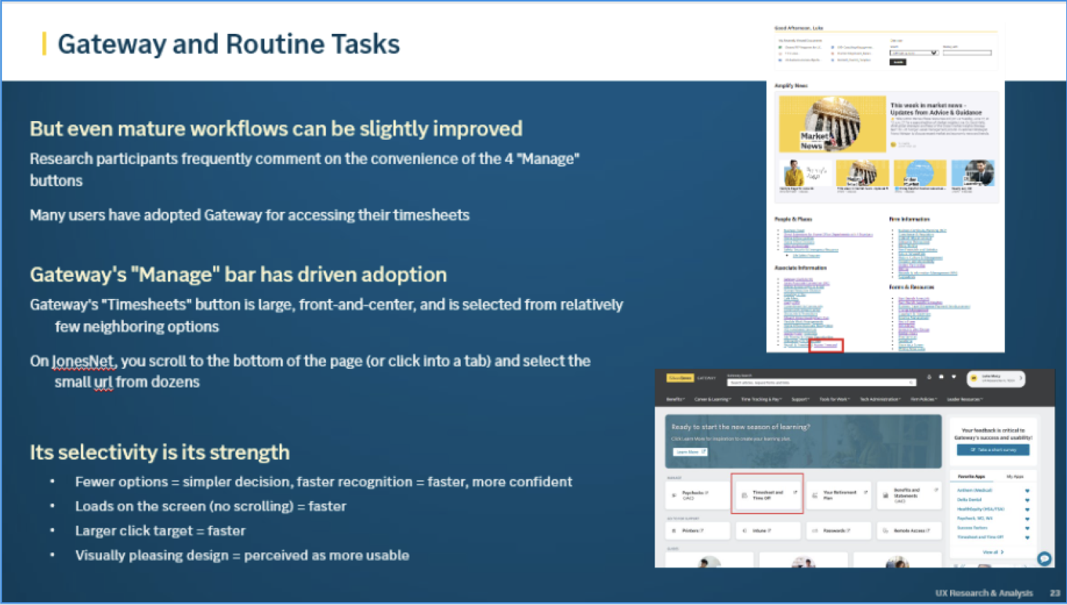
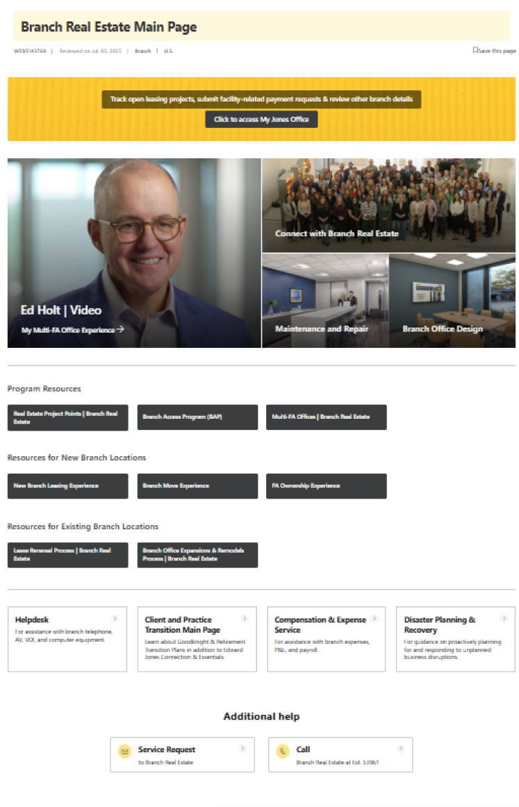
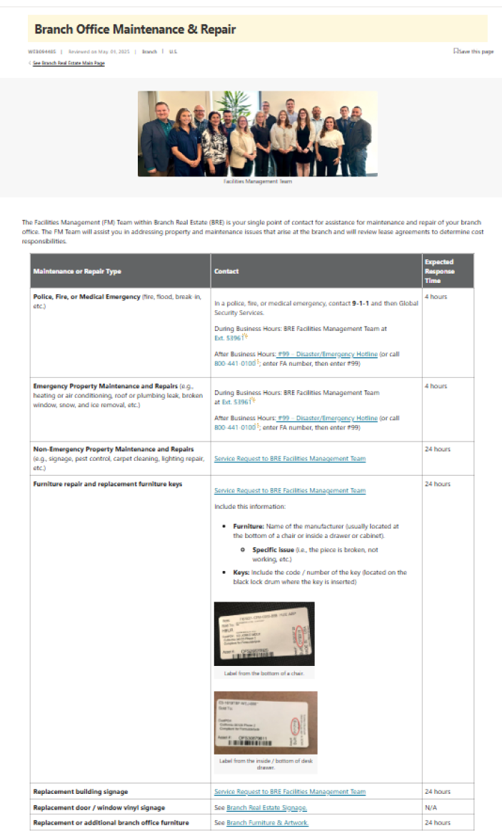
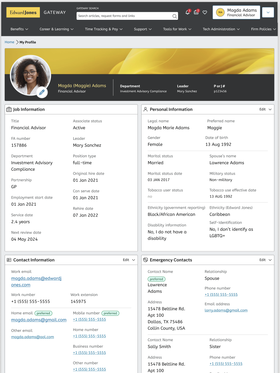
Nearly all associates begin their self-service journey on JonesLink, the firm’s primary intranet. However, JonesLink attempts to serve too many purposes at once—acting both as a comprehensive knowledge repository and as the starting point for self-service workflows.
Because these paths are not presented in an intuitive or task-oriented way, users struggle to find the right information or actions, leading to confusion and inefficiency.
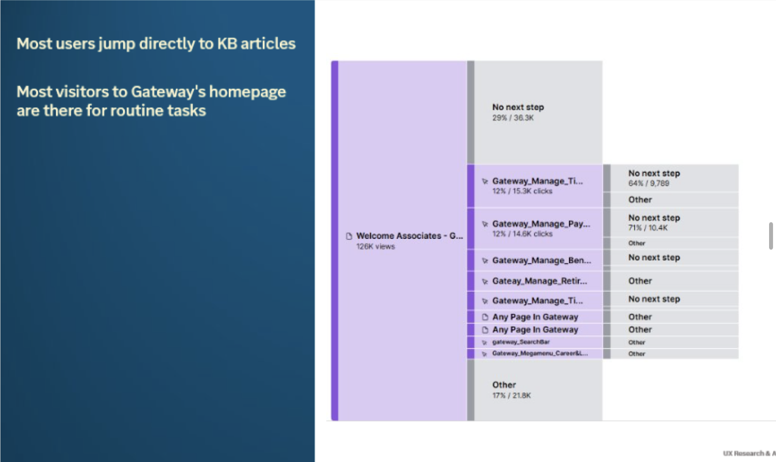
Data revealed that users were often dropped into knowledge base articles rather than workflows for routine tasks they were trying to complete
I kicked off the project by setting up calls and interviews with associates to understand common workflows and I also partnered with stakeholders to surface systemic inefficiencies affecting business needs and outcomes.
These conversations helped ground the work in real use cases and exposed where users were getting stuck, spending too much time or defaulting to the Help Desk.
Most user scenarios aligned with typical self-service needs
-Accessing tax or payroll information
-Reviewing benefits
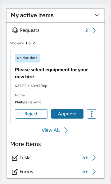
-Submitting IT and Help Desk requests
These were common, high-frequency workflows that we/users felt should have been easy to complete, but the experience lacked a clear and straightforward path for users.
I observed users aimlessly clicking through navigation, often revisiting the same tabs in hopes of quickly spotting the information they were searching for.
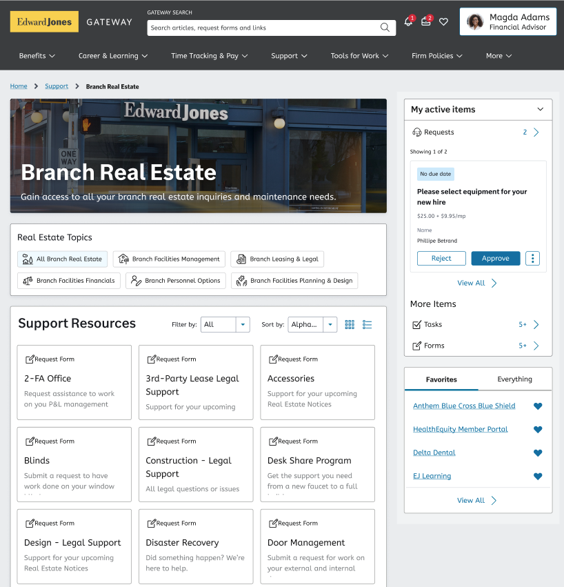
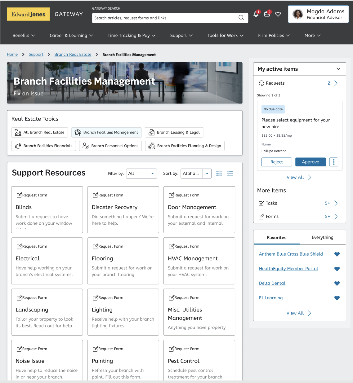
With my design work I aimed to streamline the path for associates to find the right requests and workflows by eliminating steps, simplifying content, and enhancing the UI for a more intuitive experience.
I collaborated with business partners to identify the most critical and frequently used workflows and surface them - improving the experience for both associates and home-office employees while enhancing the efficiency of the overall system design—not just the UI.
My research partner and I architected the UI around the most common and high-traffic workflows, ensuring the experience was grounded in real user needs and usage patterns.
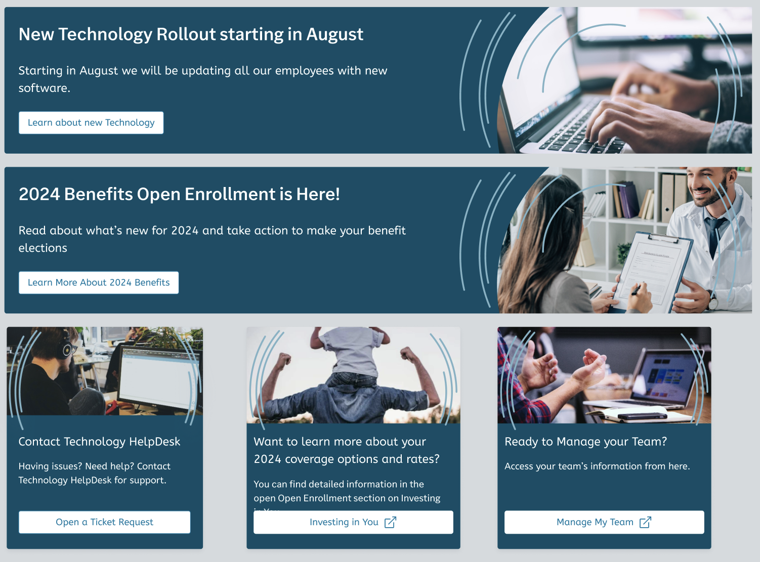
I designed flexible components and modular patterns that could be repurposed as “marketing” placements to support rotating initiatives, product rollouts, or campaigns.
It proved to be especially helpful since our business units have such diverse needs.
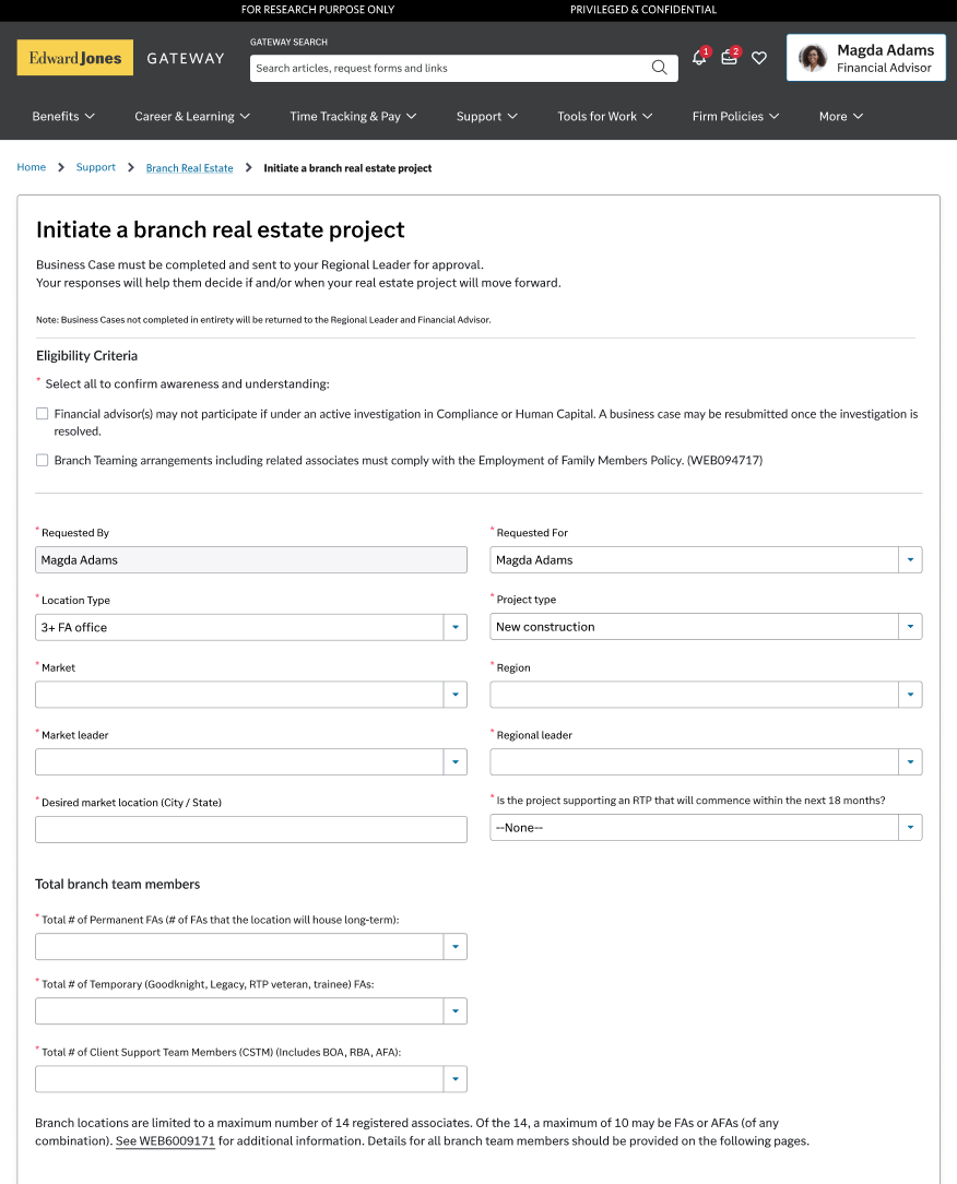
While we wanted to focus on improving the employee experience and solve for the most common use cases, one of the key focuses of this work was supporting Edward Jones’ office consolidation initiative.
EDJ has nearly 16,000 branches/offices nationwide. More locations than McDonalds in North America.
Over the next few years, the firm aims to reduce real estate costs, optimize operational efficiency, and foster stronger team collaboration by transitioning from individual offices to shared spaces.
Designing self-service workflows for this initiative was critical to ensure associates could navigate moves and renovations efficiently, aligning day-to-day employee experience with high-impact business goals.

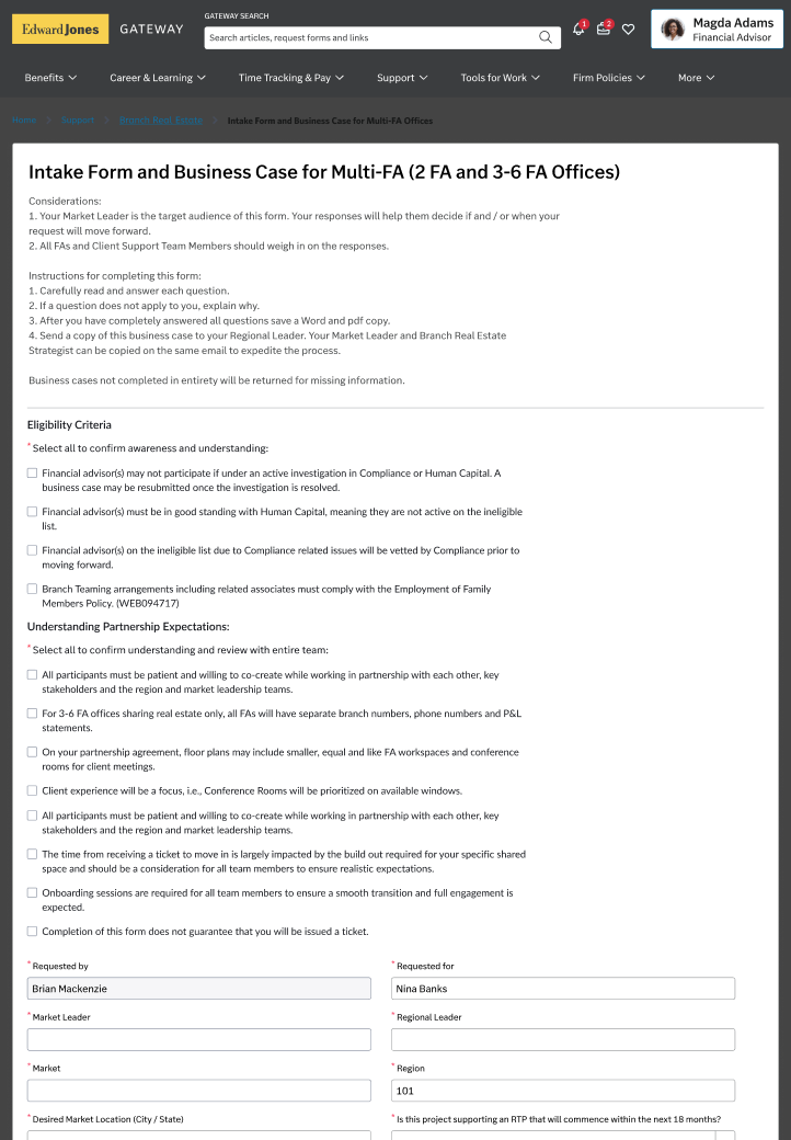
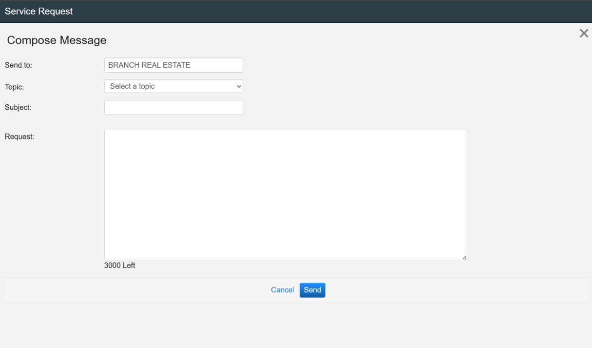
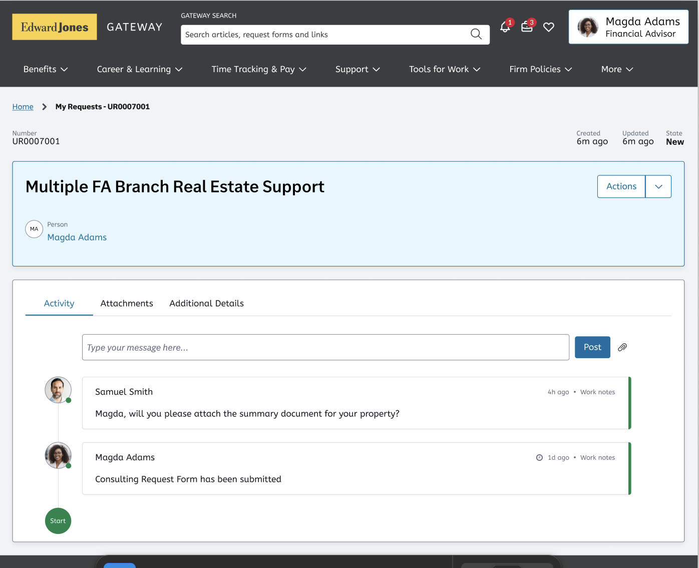
By partnering closely with the business unit, we helped drive investment in redesigned forms and workflows that streamlined how associates requested work and initiated projects, resulting in a more efficient process for both home-office and branch teams.
This shift created system records where previously processes were fragmented across emails, PDFs, and multiple platforms. As a result, projects could be formally tracked and enabled strategic opportunities for status updates, notifications, and visibility—addressing a major pain point for associates who previously felt left in the dark.
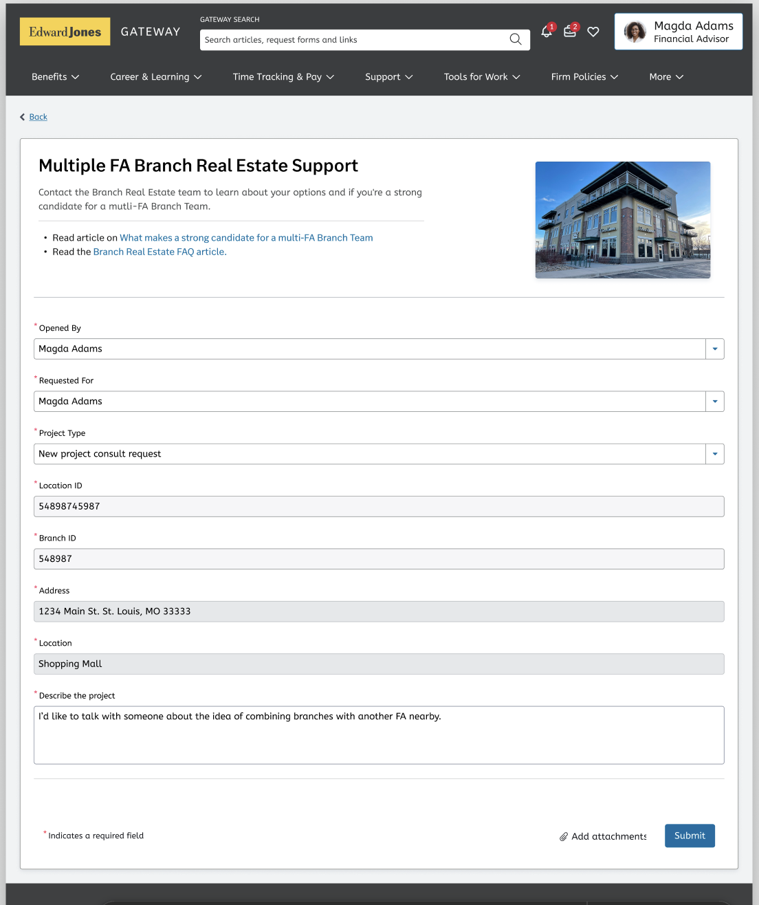
Through conversations with users, we discovered that office redesigns, renovations, and consolidations can take months or even years to complete. A major source of frustration was the lack of visibility—users often didn’t know the status of their requests and felt left in the dark. In one case, a user waited weeks for an update, only to learn their request had not been approved due to missing information, without ever receiving a notification. We were committed to improving this process so that users could feel informed, empowered, and confident throughout the entire workflow.

This work is currently in development. We validated our approach through prototype testing with business partners, home-office employees, and branch associates, receiving consistently positive feedback. Their insights directly informed design refinements, and we continued to iterate as the solution moved toward implementation.
I am currently building out this case study - please check back soon!
In the meantime, check out the prototype to see what I designed!
Figma prototype